

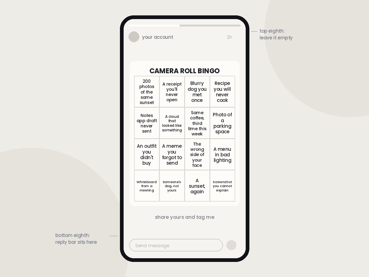
Three different people sent me the same bingo card in one week. It was a five-by-five grid about what’s sitting in your camera roll right now — 200 photos of the same sunset, a screenshot of a receipt you’ll never look at again, a blurry picture of a dog you met once. I laughed at it, marked six squares in my head, and moved on. Then I saw it again two days later in somebody else’s Story, and by the third time it had clearly travelled a few reposts down the chain from whoever made it.
That’s the part that interests me. I’ve been making bingo cards on and off for a couple of years now, mostly out of curiosity about which ones move and which ones sit there getting polite replies. The pattern turned out to be less about design than I expected. Some of the cards that spread the furthest looked like they were made in five minutes on a phone. The ones I fussed over for an hour, with the nice serif font and the muted palette, went precisely nowhere.
So here’s what I’ve figured out about making a card people actually pass along, rather than one they just tap through.
Why bingo travels when a poll sticker doesn’t
The numbers explain some of it. Socialinsider’s 2026 benchmark analysis of tens of millions of posts puts Instagram’s average engagement rate at 0.45% in Q2 2026, down across every format, and their wider platform report found average comments per post on Instagram fell by 16%. People are interacting less by default. Anything that only asks for a tap is fighting a losing trend.
A poll sticker ends where it started. Someone votes, you get a number, and that’s the whole life cycle of the thing — it lives and dies inside your own Story. A bingo card does something structurally different. Because the person has to mark it themselves, the finished card is about them, not about you. It has their answers on it. And once it’s about them, they want to show it, which means it leaves your account and lands in front of an audience you don’t have access to, with your original still attached at the bottom.
On TikTok and Reels the mechanic shifts slightly but the logic holds. There the card works as a script. You put it on screen and read the squares out while people pause the video to score themselves, and the comment section fills up with numbers. Anyone who scores badly wants to say so publicly. Anyone who scores well wants to say so louder. It’s one of the few formats where a stitch or a duet is the obvious response rather than something you have to beg for, which is the same reason the POV format keeps resurfacing.
The four formats that keep working
Camera roll bingo is the one I keep coming back to, because the source material is universal and slightly embarrassing. Everybody has 40 near-identical photos of the same thing. Everybody has a screenshot they can no longer explain. You’re not asking people to reveal anything, you’re just naming something they already know about themselves.
Get-to-know-me bingo is the older, friendlier cousin, and it’s the version that works best for accounts building a community rather than chasing reach. It’s the same idea as the get to know you bingo cards people use for icebreakers, moved onto Stories: squares like “has lived in three countries”, “can’t drive”, “has a middle name nobody knows”. I’ve used this one when I’ve had a run of new followers and wanted to give them a reason to reply.
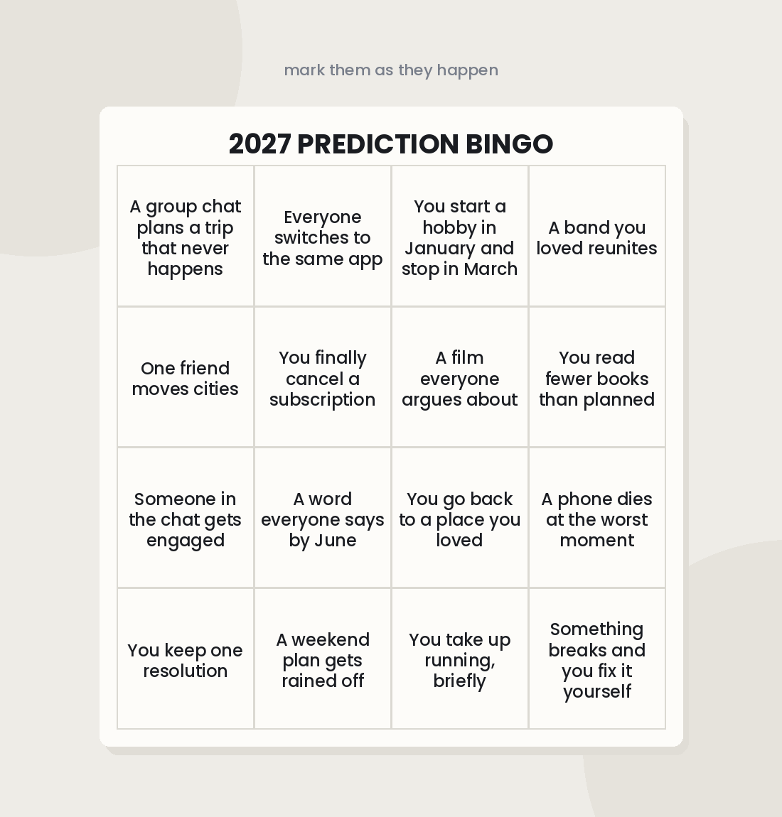
Prediction bingo is the seasonal monster. Every December, cards start going round with squares for what people think the next year will bring, and they get filled in, screenshotted and argued about for about six weeks before disappearing entirely. Searches for year prediction bingo cards climb steeply through November and peak in the first week of January, which tells you exactly when to have yours ready. The same shape works for a season, an awards show, or a series finale.
Insider bingo is the narrowest and, for anyone with a niche, often the highest-performing. Squares that only make sense to teachers, or nurses, or people who work in agencies, or people who own a particular breed of dog. Reach is smaller. Reposting is much higher, because being seen by your own people is the whole appeal.
Building the card so it survives a phone screen
This is where most cards fall apart, and the fix is boring: use fewer squares than you want to.
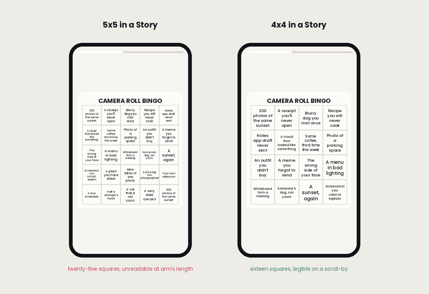
Five-by-five is the classic bingo grid and it’s the wrong choice for a Story. Twenty-five squares of text inside a 9:16 frame means each square gets a font size that’s unreadable at arm’s length, and people will not zoom. Four-by-four is my default for Stories. Three-by-three works surprisingly well for a punchy card with longer, funnier squares. Save the full five-by-five for a carousel post or a Reels cover, where people are holding the phone closer and the image isn’t disappearing in seven seconds.
Then leave room at the edges. The top of a Story gets eaten by the profile bar and the bottom by the reply field, and if someone reshares your card it gets shrunk and stacked with a sticker on top of it. I keep roughly the top and bottom eighth of the frame empty. It looks like wasted space in the editor and it’s the difference between a legible repost and a card with two rows covered.
Contrast matters more than palette. Dark text on a plain light background beats anything layered over a photo, every time. And if you’re not confident about building the grid yourself, a bingo card maker will do the alignment and spacing for you — the card creator lets you set the grid size, drop in your own words and adjust the colours, which is faster than fighting with shapes in a design tool. If your theme works better visually than verbally, picture and emoji squares solve the font size problem entirely, because an image reads at any scale.
Writing squares nobody can scroll past
Specificity is the entire game. “Takes a lot of photos” is nothing. “Has 200 photos of the same sunset and can’t delete any of them” is a card that gets reposted, because it’s aimed at somebody in particular and everybody assumes it’s aimed at them.
A few from cards that did well for me: has a Notes app draft they’ve never sent, owns a water bottle bigger than their head, has been to the same coffee shop twice this week, screenshots recipes and never makes them, has an alarm labelled something passive-aggressive. None of them are clever. They’re just precise.
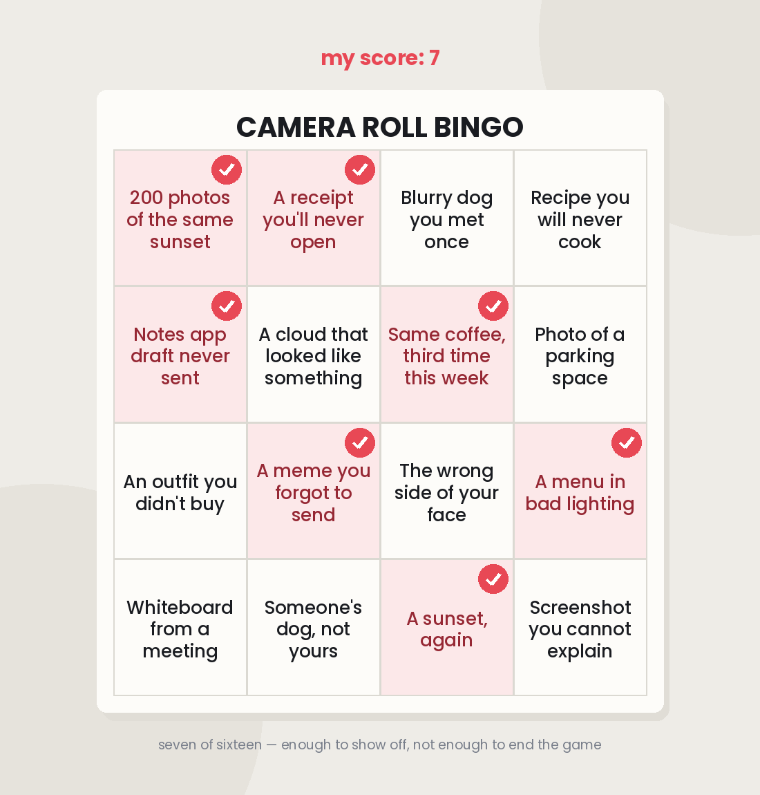
Balance the difficulty, too. If someone can’t mark a single square they’ve got nothing to show, and if they mark all sixteen it’s over in a second and there’s no tension. I aim for roughly a third of squares that almost everyone will hit, a third that maybe half will, and a few genuinely rare ones so scoring high feels like something. That mix is what makes people comment their number.
The one line I’d draw is around squares that punch down. Self-recognition is funny. Being called out for something you’re actually self-conscious about is not, and a card that makes people feel bad doesn’t get shared, it gets closed.
Posting it so it doesn’t die in your own Story
Post your own filled-in card alongside the blank one. This is the single change that moved the needle most for me. A blank grid is an instruction; a marked-up grid is a demonstration, and it tells people what the expected response looks like. I put the blank card first, my scored version second, and a line telling people to share theirs and tag me.
Then stay awake for it. The first two or three hours decide whether a card travels, and resharing every single response is what creates the chain — each repost puts the card in front of a new audience, and the people in that audience see it’s an active thing rather than something from yesterday. If you post it and walk away, you’ll get replies and nothing else.
On TikTok, film yourself going through the squares and scoring out loud, then pin a comment inviting people to duet with their own count. And whatever you make, repost it as a carousel a few days later. Stories vanish in 24 hours, but the same card in the grid keeps collecting saves and shares for weeks, and it’s the version people go back and find when they want to send it to somebody.
The mistakes I’d avoid at this point are all versions of trying too hard. Too many squares. Text sized for a laptop. A logo in the corner of something that’s meant to feel like a joke between friends. And the worst one, asking people to follow you before they can play — nobody has ever done that, and it turns a piece of fun into a transaction. Make the card easy to steal. That’s the point of it.
 Coach
Coach