In the world of online video content, first impressions matter. A well-designed image can make all the difference in grabbing attention and encouraging viewers to click. Think of it as the “book cover” for your video—it needs to stand out and spark curiosity.
Successful creators like MrBeast and Peter McKinnon understand the power of using bold colors, clear text, and thoughtful composition. These elements work together to create an instant connection with your audience. A bright, engaging design can significantly boost your video’s performance.
This article will explore proven strategies to help you craft images that captivate and convert. From choosing the right color palette to using text effectively, you’ll learn how to create visuals that leave a lasting impression. Let’s dive in and elevate your content game!
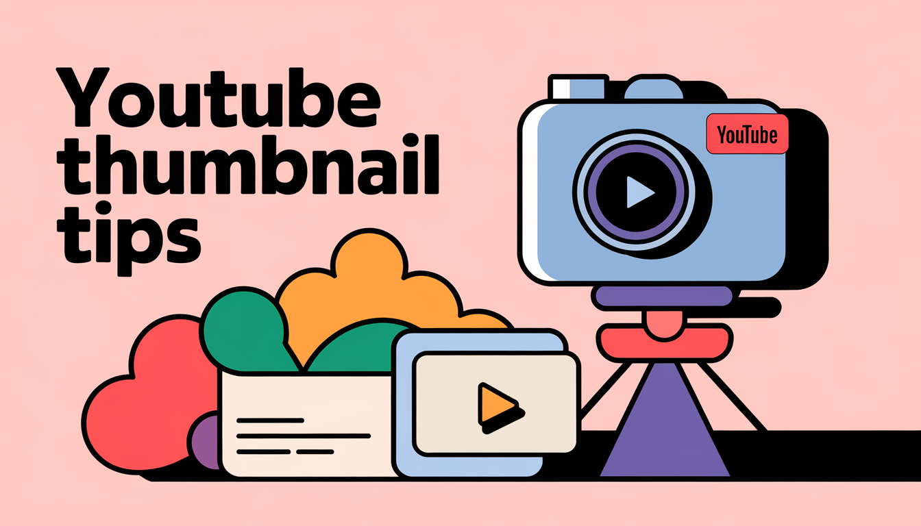
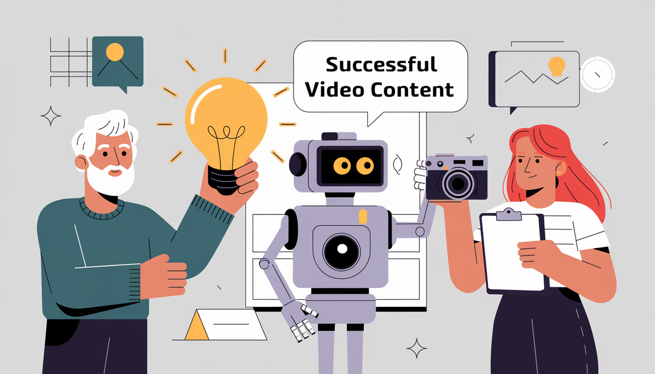
Essential YouTube Thumbnail Tips for Successful Video Content
Crafting visuals that grab attention is a skill every successful creator masters. Your design plays a crucial role in making your content stand out. It’s not just about looking good—it’s about connecting with your audience instantly.
Clarity and consistency are key. A recognizable style helps build trust and familiarity. When viewers see your visuals, they should immediately know it’s your work. This consistency strengthens your brand identity.
Featuring a relatable person or expressive face can trigger an emotional response. Studies show that human faces in visuals increase engagement. This approach makes your content feel more personal and approachable.
High-quality visuals are non-negotiable. Whether you use professional photo sessions or a smartphone, ensure your images are crisp and clear. Blurry or pixelated visuals can deter potential viewers.
Align your design with your brand identity. Every element, from colors to fonts, should reflect your content’s theme. This alignment creates a cohesive experience for your audience.
Choosing Quality Images and Crisp Designs
Your audience’s first impression often hinges on the clarity of your visuals. High-resolution images dramatically improve the professional appearance of your content. Blurry or pixelated visuals can deter viewers, while crisp designs enhance credibility and trust.
There are several ways to obtain quality images. Professional cameras deliver stunning results, but even a well-taken smartphone photo can work wonders. The key is to focus on lighting, composition, and resolution to ensure your visuals stand out.
Tools like Canva and Adobe Photoshop are excellent for refining image quality and design. These platforms offer features to enhance clarity, adjust colors, and add text effectively. For example, Canva’s user-friendly interface makes it a great choice for beginners.
Attention to detail in image quality can be a major factor in whether viewers decide to click on your content strategies. Investing time in mastering high-quality visuals gives you a competitive edge. It’s a simple yet powerful way to connect with your audience and leave a lasting impression.
Leveraging Color, Text, and Emotional Appeal
Creating visuals that resonate emotionally is key to capturing viewer attention. Bold colors and contrasting hues make your designs pop on any screen. Vibrant schemes draw the eye and create a sense of excitement, while contrasting colors ensure clarity and focus.
Choosing the right font is equally important. Legible text with a clean design enhances readability. Avoid overly complex fonts that can distract from the main message. Place text strategically to complement the visual elements without overwhelming the image.
Facial expressions and emotional cues play a powerful role in connecting with viewers. A smiling face can evoke happiness, while a surprised expression sparks curiosity. These cues help communicate the tone of your content instantly.
Studies show that visuals with well-chosen colors and minimal text drive higher engagement. Balance is crucial, too much text can clutter the design, while too little may fail to convey the message. Aim for a harmonious blend of visual and textual elements if you want to create viral YouTube shorts.
Designing Thumbnails That Accurately Represent Your Video
Your video’s first impression starts with a design that tells the truth. Authentic visuals build trust and ensure viewers know what to expect. Misleading images may get clicks, but they hurt long-term engagement and credibility.
Pairing your design with a clear, concise title is key. The title should complement the visual, giving viewers a complete understanding at a glance. This combination helps reduce confusion and increases click-through rates.
Background choice plays a big role in conveying context. A well-chosen background sets the tone and provides subtle cues about the video’s content. For example, a vibrant cityscape might suggest travel, while a cozy room hints at lifestyle topics.
Best practices include using visuals that preview the video’s subject matter. Avoid overloading the design with text or unrelated images. Instead, focus on clarity and relevance to create a true representation.
Accuracy in design is essential for maintaining viewer trust. When your visuals match the content, viewers are less likely to leave early. This reduces bounce rates and encourages repeat engagement.
Top creators like Marques Brownlee and Emma Chamberlain excel at this. They pair consistent titles with thoughtful backgrounds, establishing brand credibility. Their designs are honest, engaging, and aligned with their content themes.
Incorporating Branding and Consistency in Your Thumbnails
Building a recognizable identity starts with consistent design choices. When viewers see your content, they should instantly know it’s yours. This recognition is a key element in building trust and loyalty.
One of the most effective ways to achieve this is by repeating specific elements like logos, signature colors, and fonts. These components create a cohesive look that reinforces your brand. For example, using the same color palette across all designs helps your content stand out in search results.
Consistency also helps viewers quickly recognize your content. When they see familiar visuals, they’re more likely to click. This familiarity is a strong point of differentiation in a crowded market. It builds loyalty and encourages repeat engagement.
To ensure uniformity, consider creating a style guide for all your designs. This guide should outline your preferred colors, fonts, and layouts. It’s a simple yet powerful way to maintain consistency and elevate your brand.
Advanced Strategies: Testing and Analyzing Thumbnail Performance
A/B testing is one of the most effective methods to determine which designs resonate best with your audience. Tools like TubeBuddy simplify this process, allowing you to compare two versions of an image and analyze performance metrics like watch time and click-through rates.
Analyzing data across different devices and platforms ensures your visuals look great everywhere. What works on a desktop might not have the same impact on a mobile device. Testing helps you identify these nuances and optimize your designs for maximum visibility.
Minor adjustments, like tweaking colors or text placement, can significantly improve performance. For example, a brighter color scheme might attract more clicks, while a well-placed text overlay can enhance clarity. These small changes, backed by data, can lead to big results.
Heatmap analysis is another powerful tool. It shows where viewers’ eyes land first, helping you design visuals that grab attention instantly. By focusing on these high-impact areas, you can create more compelling images.
Continuous experimentation is key. Viewer preferences evolve, and staying ahead requires regular testing and refinement. A data-driven approach ensures your visuals remain effective and relevant, no matter the platform or device.
Optimizing Thumbnail Designs for Various Devices
Designing visuals that work seamlessly across devices is essential for capturing attention. With viewers accessing content on smartphones, tablets, and TVs, your designs must adapt to every screen size. A crisp, well-composed photo ensures your visuals look professional, no matter the device.
Scaling your designs without losing clarity is key. Use high-resolution images and avoid overcrowding the area with text or elements. A clean layout ensures your message remains clear, even on smaller screens. Tools like Canva and Adobe Photoshop offer templates that simplify this process.
Testing your visuals across multiple devices is crucial. What looks great on a desktop might appear cropped or blurry on a phone. Preview your designs using software features that simulate different screen sizes. This step helps address issues like text legibility and image cropping.
Adapting templates for various resolutions ensures consistency. A 16:9 aspect ratio is ideal for most platforms, but always verify how your design appears on different devices. This approach maximizes your chances of success and keeps your visuals impactful.
Top creators often use design software to preview their work before finalizing. Features like device mockups allow you to see how your visuals will look in real-world contexts.
By optimizing your designs for every device, you can increase click-through rates and ensure your visuals leave a lasting impression. Consistency and adaptability are the keys to success in today’s multi-device world.
Wrapping Up With Key Takeaways on Crafting Stunning Thumbnails
Thoughtful thumbnail design is your secret weapon for making your content stand out and your audience curious. In a crowded platform like YouTube, it’s not just about creating something visually appealing. It’s about forging an instant connection that drives clicks and builds loyalty.
Remember to use bold colors, clear text, and high-quality visuals that align with your brand identity. Consistency across all your thumbnails reinforces trust and recognition over time.
Test and adapt designs for all devices to ensure strong content visibility and gain an edge in today’s fast-paced world.
Effective thumbnails blend art, science, and strategy and creators who master this balance stay ahead of the competition.
Ready to take your social media game even further? At The Social Skinny, we help you master every platform from YouTube thumbnails to what to post on Pinterest and beyond.
Our expert strategies make sure your visuals, posts, and brand storytelling drive real engagement and results.
Sign up today to unlock smarter strategies, tailored insights, and creative ideas that will make every post a standout success!